


Responsive Web Design 2018
Understanding Responsive Web Design For Your Brand
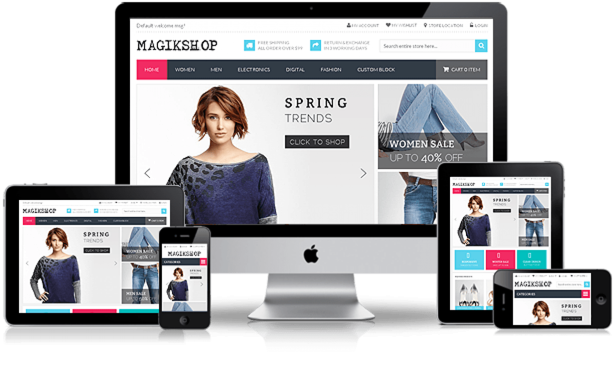
Responsive Design On The Web
Over the past decade, the number of smart devices, internet-capable devices, mobile devices, and computers has proliferated to a staggering degree, and web design no longer focuses only on desktop displays. More people use smartphones, tablets, and other mobile devices to access the web, and responsive web design makes this possible. It’s essential to understand how responsive design works so you can capitalize on the benefits for your own brand.
Instead of creating a consistent appearance for every device like in traditional web design, responsive web design reconfigures a website’s display and layout based on the device used to access it. For example, a website viewed on a desktop may have a banner image, header links, and sidebars on either side of the page, strafing the main content in the middle. On a tablet, the website may drop the sidebars and compress the header links into a drop-down menu to make the page’s content more navigable and readable, instead of compressing everything down into a smaller version of the desktop format. For a smartphone, responsive design can account for screen rotation to provide different layouts and content structures based on the user’s preferences.
Harnessing Responsive Design
If you want to learn how to design a website, one of the first problems you have to tackle is how to reach a wide audience using a variety of different devices and displays. Good web page design means that the page loads and performs well no matter how a user accesses it. Without responsive design, a website may load well and look and function admirably on a desktop or laptop display, but then appears unfocused, cluttered, or unintelligible on a smaller screen.
Touch functionality is another critical factor. If your website does not account for touch controls, visitors using mobile devices will find it difficult to navigate. Responsive design allows for high-quality web design elements like expanding content folders and multiple configurations for device orientation.
Who Needs Responsive Design?
You may wonder who needs to worry about responsive design outside the world of website marketing, but the reality is that every company with an online presence benefits from responsive design. While responsive design truly shines on e-commerce platforms, any website benefits from having readable, accessible content available on any internet-capable device.
Responsive Design For E-Commerce
Some businesses rely heavily on e-commerce due to the fact that Americans do most of their shopping online today. Other companies who may not have a need for an e-commerce platform still benefit from responsive design, however. Business owners who do not do any e-commerce or those who solely rely on a physical retail location can deliver content and provide an updated website that performs admirably on a variety of devices. This helps build customer trust and loyalty. If they can trust your website to work well no matter how they access it, it conveys a sense of quality.
For e-commerce focused businesses, responsive design is critical. Good design during the shopping and checkout processes can secure a sale, encourage repeat and impulse sales, and take advantage of mobile technologies like geo-targeting and marketing beacons. Your customers will be able to interact with your brand more fluidly and more easily on any type of device if you implement responsive design in your site’s construction.
Page Functionality
Visitors to your website won’t stay for long if pages take too long to load, images distort on different devices, or they can’t access the same content on their phones as their desktops. Responsive design allows you to load the web page assets that are most crucial for each platform while saving performance. A mobile version of a web page may load more slowly because of high-resolution images, animations, or video content, but responsive design will help you find a configuration that performs admirably without diluting the value of your website’s content.
Professional website development hinges just as much on function as it does on form and aesthetics. Creating a robust, memorable user experience means meeting customers’ demands in a very short time, regardless of whether or not your goals include e-commerce success. Responsive design allows for adjustments such as swapping a video on desktop with a series of still images the user may tap through with a finger. Providing an optional link for the video content offers choices to the user, and micro-interactions such as manually flipping through images and animations can be pleasant and memorable experiences for your visitors.
The Value Of Digital Presence
A functional, attractive, and easily navigable website is an asset for any brand. Even small mom-and-pop businesses benefit from having an online presence due to the omnipresence of social media and digital communication. If your customers cannot find you online, they won’t find you at all. Responsive design is scalable, and minimalism is still a crucial component of modern interface design.
The scalability and customization responsive design affords is also a much wiser investment than a proprietary application. While many brands release their own apps, those apps may only work on a few operating systems or device types. Instead of potentially alienating a section of your consumer base, create a mobile version of your website with responsive design to provide the best experience possible to the widest audience.
Shareable Content
Social media plays a large role in modern life, and you can boost your digital presence with shareable content. Provide your customers with emails, blog posts, guides, and promotions that encourage them to share your content with others. This expands your sphere of influence and drives sales, connections, and ultimately revenue.
Building Your Digital Community
Unless you have a readily available in-house team of web designers, finding the right web design company for responsive design projects is a very serious choice for any brand. The right e-commerce web designer can help you secure explosive growth in online sales, and any company will benefit from an attractive, functional, and reliable website. Responsive design ensures your audience can always find you.
Crown Media Studio is a high-quality, Charleston based website design company offering design, development, and marketing services to clients in various industries. We develop designs, content strategies, and development projects for small businesses, ministries and professional service organizations. Consider the return on investment you could see when you work with Crown Media Studio to build a more responsive website.